In Greenwich, you are not competing for attention in the same way as a commodity business. You are competing for trust, confidence, and perceived value. That is a different fight entirely. High-value clients do not browse casually, forgive sloppiness, or spend time trying to decode what you do. They land on your website, make a judgment in seconds, and move on if the experience feels off.
Most business owners assume that if their referrals are strong, reputation is established, and service is excellent, the website matters less. That logic is expensive. Referrals still check you out. Prospects still compare you. Decision-makers still use your site as a filter before they ever speak to you. And in an affluent market like Greenwich, the filter is brutal.
The businesses that lose the best opportunities are rarely the worst at what they do. More often, they are the ones with a website that quietly undermines their actual quality. The site looks dated. The messaging is vague. The photography feels generic. The mobile experience is clumsy. The calls to action are weak. Nothing looks disastrous, but everything feels just uncertain enough to create doubt.
And doubt kills premium deals.
A high-value client is not looking for more information. They are looking for reasons to eliminate risk. Your website either reduces that risk immediately or increases it. There is no neutral middle ground.
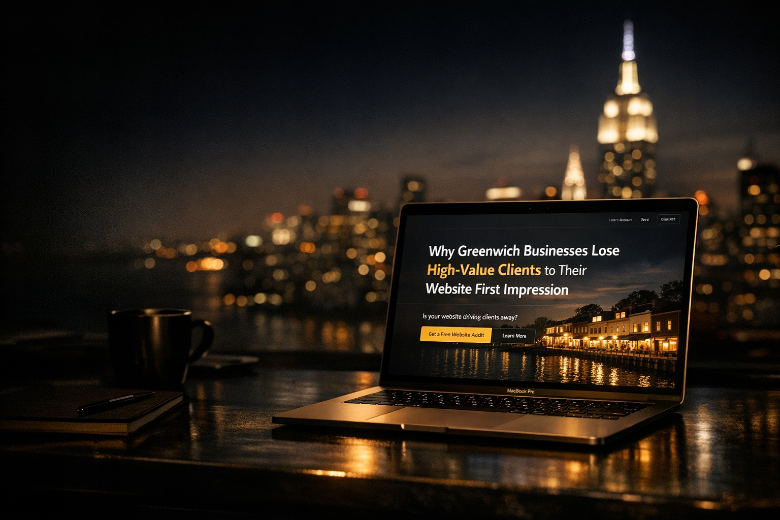
The first impression problem is usually a trust problem
Businesses love to talk about traffic, rankings, and lead generation. Those matter, but they come after a more basic question: when the right prospect lands on your website, does the experience make them feel confident enough to take the next step? If the answer is no, your marketing problem is not reach. It is trust erosion.
In Greenwich, where wealth, expectations, and competition all run high, trust signals carry more weight than most companies realize. A prospective client is not just asking whether you are capable. They are asking whether you feel established, whether your standards match theirs, and whether hiring you is going to be smooth or frustrating.
Affluent buyers do not tolerate digital inconsistency
High-value clients are exceptionally good at spotting inconsistency. They may not articulate it in technical terms, but they feel it instantly. If your firm presents itself as sophisticated, but the website looks five years behind, the mismatch creates friction. If your copy says you deliver white-glove service, but the user experience is confusing, the claim loses credibility. If your business is positioned as premium, but the site feels templated, prospects assume the operation behind it is less polished than advertised.
This is where many Greenwich businesses make a costly mistake. They believe quality speaks for itself. In reality, quality has to be translated. Your website is one of the primary translators.
Consider a wealth management firm, private medical practice, boutique law office, luxury contractor, or high-end home service brand. In each case, the buyer is not making a low-risk purchase. They are choosing a relationship, often with significant financial or personal stakes attached. They are scanning for signs of discipline. Not just in your words, but in your presentation.
That is why weak design choices have outsized consequences. Stock imagery signals laziness. Generic headlines signal commoditization. Thin service pages signal a lack of depth. Slow load times signal neglect. Outdated branding signals drift. These are not cosmetic problems. They affect perceived competence.
Most business owners underestimate how often a prospect leaves not because a competitor was better, but because their own website introduced subtle hesitation. And hesitation is enough. Premium buyers do not tend to “give you a chance.” They shortlist businesses that feel right immediately.
If your site no longer reflects the level of business you are trying to win, a thoughtful rebuild is often the smarter move than another round of surface edits. For companies dealing with an outdated or underperforming site, this is usually where a proper website redesign and revamp becomes less of a branding exercise and more of a revenue decision.
Your website is often the second meeting before the first call
Business owners still talk about websites as if they are digital brochures. That framing is obsolete. Your website is part sales meeting, part reputation check, part risk assessment. In many cases, it happens after a referral but before contact. The prospect has already heard your name. Now they want confirmation.
What they are looking for is simple: clarity, credibility, and signs of seriousness.
Can they immediately tell what you do and who you serve? Can they see proof that you operate at the level they expect? Can they move through the site without feeling friction? Can they find examples, results, expertise, or details that make your business feel real rather than self-promotional?
When those answers are missing, the referral weakens. The brand promise weakens. The buyer starts wondering whether your best days were behind you, whether the business is smaller than it appears, or whether your team pays attention to details only when forced to.
This is especially dangerous for service businesses in Greenwich because buyers often compare multiple firms quietly before reaching out. They may never tell you that they found your site harder to navigate than a competitor’s. They will not send feedback saying your homepage made your company feel generic. They will simply call someone else.
The invisible nature of the loss is what makes this problem persist. There is no obvious rejection. No dramatic complaint. Just fewer premium inquiries, lower conversion rates, and more price-sensitive leads who are less influenced by presentation and more driven by cost.
A strong first impression does not need to be flashy. In fact, flashy often backfires. It needs to feel controlled, clear, and credible. The best-performing sites in premium markets usually do a few things exceptionally well: they establish positioning quickly, remove confusion, use language that sounds like a real business rather than a marketing committee, and make the next step feel easy.
What actually makes high-value clients stay, trust, and inquire
If your current website is costing you better opportunities, fixing it is not about adding more pages or stuffing in more content. It is about aligning perception with the level of client you want to attract. That requires sharper decisions than most companies make.
Clarity beats cleverness every time
One of the most common problems on business websites is the attempt to sound elevated at the expense of being understood. Owners want the brand to feel sophisticated, so the copy becomes abstract. Taglines say nothing. Headlines rely on vague words like excellence, innovation, bespoke, transformative, or trusted partner. The result is polished confusion.
High-value clients are busy. They are not going to decode your positioning for fun. If your homepage does not immediately answer who you help, what you do, and why your approach is different, you are forcing the prospect to work. That is the opposite of premium.
The businesses that convert better tend to communicate with precision. They do not hide behind inflated language. They make their value legible. A boutique construction firm should sound like it understands timelines, execution, complexity, and finish quality. A legal practice should sound decisive and capable, not stuffed with empty adjectives. A medical or wellness provider should project authority and trust without sounding cold or corporate.
This also applies to structure. Your website should guide people through a clear narrative. Not your entire company history. Not every service variation on one bloated page. A clear path. Here is what we do. Here is who we do it for. Here is why clients trust us. Here is what to do next.
What most businesses do wrong is assume more words equals more persuasion. Usually the opposite is true. Better websites do not overwhelm. They sequence information intelligently. They answer objections before the buyer has to ask. They create momentum.
For businesses in competitive local markets, that often means treating the website as a strategic business asset, not a side project. If your company needs a site that supports growth instead of quietly capping it, investing in a stronger website presence is not cosmetic. It is operational leverage.
Premium perception comes from disciplined execution
There is a temptation to think premium websites are defined by expensive visuals. They are not. Premium perception is created by consistency and discipline.
That means typography that feels intentional, not accidental. Photography that reflects the real standard of the business. Page layouts that breathe. Mobile responsiveness that does not collapse under pressure. Forms that are simple and functional. Case studies or proof points that show substance. Messaging that sounds confident without trying too hard.
It also means respecting the user’s time. High-value clients notice when a site is hard to navigate, overloaded with motion, or built around what the company wants to say instead of what the buyer needs to know. They notice when there are three different visual styles on one site. They notice when buttons are inconsistent, internal pages are thin, or the experience feels stitched together over time.
These details matter because they imply how the business operates. A precise website suggests a precise company. A sloppy website suggests hidden friction, poor follow-through, and avoidable headaches.
This is where many businesses in affluent markets sabotage themselves. They rely on reputation earned offline while neglecting the digital environment where trust now gets verified. They keep a website that was “good enough” when the business was smaller, less competitive, or less ambitious. Then they wonder why their strongest leads are not converting at the same rate.
The answer is often simple: the website is attracting attention but failing the credibility test.
If you want better clients, your site has to do more than exist. It has to reassure, position, and convert. It has to reflect the seriousness of your business before a conversation begins. And if it does not, the market will not politely wait for you to catch up.
In Greenwich, where high-value buyers have options and high standards, first impressions are rarely superficial. They are economic. A website that feels dated or unclear does not just hurt aesthetics. It reduces inquiry quality, weakens close rates, and pushes premium prospects toward firms that look more prepared.
That is the real cost. Not a bad website in theory, but the compound revenue loss that comes from looking less credible than you actually are.
The businesses that win more of the right clients understand this. They stop treating digital presentation as a design issue and start treating it as a trust and sales issue. Once that shift happens, better decisions follow: sharper messaging, stronger structure, better proof, cleaner user experience, and a site that finally supports the level of business they are trying to build.
And in a market like Greenwich, that shift is often the difference between being respected and being chosen.