Parents don’t choose a pediatric practice the way they choose a sandwich shop. The stakes are higher, the emotions are sharper, and the scrutiny is brutal. They are not casually browsing. They are looking for someone they can trust with their child.
That changes what your website has to do.
Most pediatric practice websites in Westchester miss this completely. They try to look respectable, list services, show a photo of the office, and call it a day. The result is predictable: the site gets traffic, but too few appointment requests, too many phone drop-offs, and too many families who leave to compare you with another practice that simply feels easier to trust.
A high-converting website is not just a prettier version of what you already have. It is a system built to reduce hesitation, answer the real questions parents have, and move people toward action without making them work for it.
In a market like Westchester, where parents have options and expectations are high, that difference matters. If your site creates even a little friction, families notice. If your messaging feels vague, families hesitate. If your online experience feels dated, families start wondering whether everything else is dated too.
A strong pediatric website should do three things well: create immediate trust, make action simple, and support the way local families actually make healthcare decisions. That sounds obvious. In practice, most websites fail on all three.
Trust has to be obvious before parents ever call
Your homepage should calm concerns fast, not bury the important stuff
The first few seconds matter more for a pediatric practice than for almost any other local business. Parents land on your website with a specific emotional state. Maybe they just moved to Scarsdale and need a new pediatrician. Maybe their child is sick and they need to know whether you offer same-day appointments. Maybe they are comparing your office with two others in Rye Brook or White Plains. Whatever brought them there, they are not in the mood to dig.
What most practices do wrong is open with generic branding language. “Compassionate pediatric care for your family” sounds nice, but it does not answer the questions that drive action. Parents want to know if you are accepting new patients, where you are located, how quickly they can book, what age groups you serve, whether you take their insurance, and whether your office feels organized and trustworthy.
A high-converting homepage gets to those answers quickly.
That means your value proposition cannot be soft or ornamental. It should be concrete. If your practice offers same-day sick visits, say that immediately. If you have extended hours for working parents, put that near the top. If you have multiple providers, mention it in a way that reassures families about access and continuity. If your office serves specific Westchester communities, make that visible. Local relevance builds trust because it signals familiarity and convenience.
The homepage should also make the next steps unmistakable. “Request an appointment” should be prominent. So should “Call now,” especially on mobile. If families need forms, insurance information, or directions, they should not be buried in a maze of dropdowns.
This is where many pediatric practices quietly lose revenue. Not because the care is bad, but because the website asks busy parents to do too much work. A mother standing in a school pickup line is not going to hunt through five pages to figure out whether your practice sees newborns. She is going to leave and try the next office.
Strong websites remove those exits.
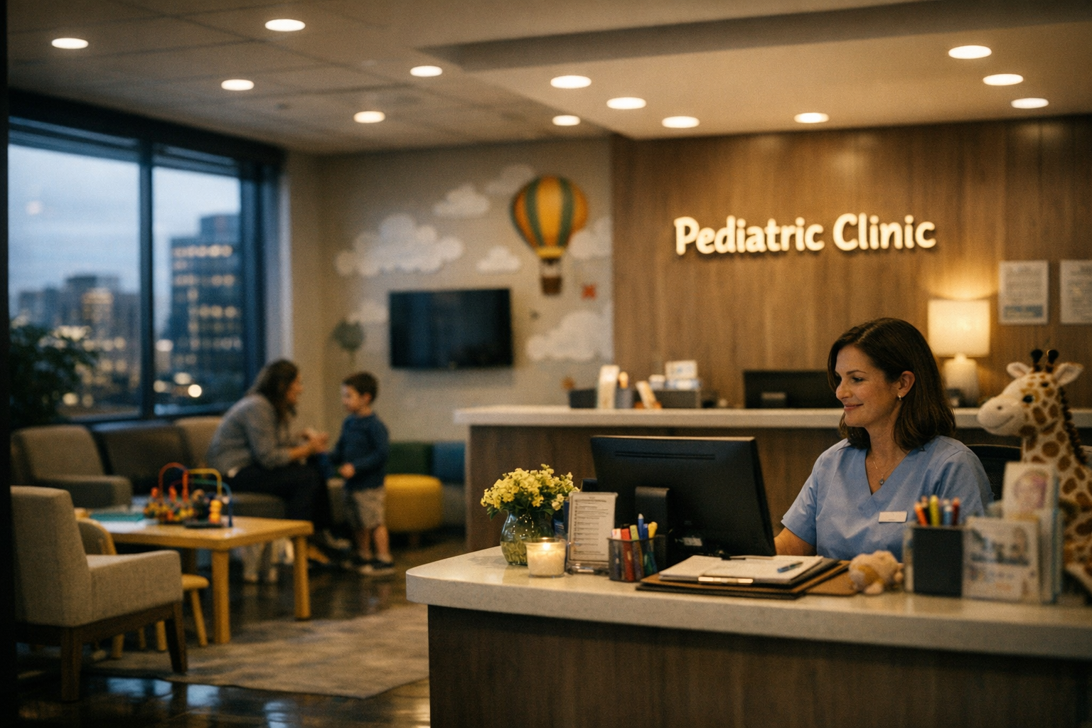
They also use visuals strategically. Real photos of your office, providers, and staff matter far more than stock imagery of smiling children. Parents are evaluating signals. Is this place warm? Organized? Modern? Professional? Does it feel like the kind of office where calls are returned and appointments run reasonably on time? Your website should answer those questions without saying them out loud.
If your current site feels dated, cluttered, or hard to use on a phone, that is not a branding problem. It is a conversion problem. In many cases, the smartest next step is not patching the old site but investing in a full website redesign for your Westchester practice so the experience actually matches the level of care you provide.
Social proof and practical proof both matter more than polished copy
Most practices overestimate how persuasive their own words are. Parents expect you to say you are caring, experienced, and committed. That language has almost no weight by itself.
What moves people is evidence.
That evidence comes in two forms: social proof and practical proof.
Social proof includes reviews, testimonials, reputation signals, and the subtle credibility that comes from being clearly established in your area. If Westchester parents consistently mention that your staff is responsive, your office is clean, and your providers are thorough, that matters. Not because reviews are a box to check, but because they reduce uncertainty. Families want reassurance from other families.
Practical proof is even more underrated. This is where your website demonstrates competence through clarity. Do you clearly explain what to expect for newborn visits? Do you make school physicals and immunization support easy to understand? Do you answer common questions about sick visits, after-hours communication, and patient forms without making people call for basic information? Every unanswered practical question adds friction.
A high-converting pediatric website uses this kind of proof throughout the experience. Not in a giant wall of text, and not tucked away on a forgotten FAQ page nobody sees. It shows up where decisions are being made.
For example, your provider pages should not read like stiff résumé summaries. They should feel human and useful. Parents want credentials, yes, but they also want to understand your approach. If a provider has a particular strength with first-time parents, adolescent care, asthma management, or developmental concerns, that should be visible. Specificity builds confidence.
Location pages and contact pages are another missed opportunity. Too many practices treat them like administrative leftovers. In reality, these pages often sit right before conversion. If your office is in Westchester, families want confidence about parking, office access, nearby landmarks, and whether the location is practical for their daily routines. Convenience is not a side issue. It is part of the sale.
And then there is mobile performance. A pediatric site that loads slowly or feels clumsy on a phone is quietly training parents not to trust it. That sounds harsh, but it is true. People connect digital polish with operational competence. If the online experience feels behind, they start to wonder what else is behind.
Conversion happens when the website makes taking action feel easy
Every important action should be simpler than calling another practice
A lot of pediatric websites are built like brochures. That is the wrong model.
A brochure informs. A high-converting website moves people.
That means every core action should be frictionless. Booking an appointment. Calling the office. Completing patient forms. Checking accepted insurance. Finding office hours. Learning whether newborns are being accepted. Asking a pre-visit question. None of this should feel like work.
Most businesses underestimate how quickly users give up. In healthcare, especially with parents, the threshold is even lower because the context is busy and emotional. They are often multitasking. They are tired. They are comparing several options quickly. If your website creates small frustrations, they add up fast.
What actually works is ruthless simplification.
Your primary calls to action should stay consistent throughout the site. If “Request an Appointment” is the main goal, it should appear prominently on the homepage, provider pages, contact page, and mobile navigation. If you also want calls, the phone number should be tap-to-call and constantly accessible on mobile. Do not make users re-find basic pathways.
Forms deserve special attention. Long, clunky forms kill conversions. Ask only what is needed for the next step. If you want a parent to request an appointment, do not demand their full life story before anyone has spoken to them. Name, contact details, child age range, preferred visit type, and scheduling preference are usually enough to start a conversation. The more fields you add, the more families disappear.
Navigation should follow how parents think, not how your practice is internally organized. “Services” is fine. “New Patients” is essential. “Meet the Providers” matters. “Forms,” “Insurance,” and “Contact” should be easy to spot. If your menu forces people to guess where key information lives, conversions suffer.
The same goes for urgency. When a parent needs care quickly, vague wording hurts. If same-day visits are available, be explicit. If there is a nurse line, explain how it works. If certain issues should be handled by phone rather than online form, say so clearly. Good conversion design is often just honest operational clarity.
For practices serious about growth, this is where custom website strategy matters. A generic template will not account for your scheduling reality, patient mix, service priorities, or local competition. A purpose-built website for a Westchester County business can shape the user journey around what actually drives more appointments instead of what looks fine in a demo.
Local search intent should connect directly to appointment intent
For pediatric practices in Westchester, website conversion is tightly connected to local visibility. These are not separate conversations. If parents search “pediatrician near me,” “newborn pediatrician Westchester NY,” or “same day sick visit White Plains,” the job is not just to appear in search. The job is to turn that visit into action.
This is where many practices leak opportunity. They may have some search presence, but the landing experience is weak. The page ranks for a local term, yet gives the visitor no compelling reason to book. Or it mentions a town name once and assumes that is enough. It is not.
A high-converting local website aligns message, location, and intent.
If you serve multiple towns in Westchester, that should be reflected thoughtfully in the site structure and content. Not through lazy keyword stuffing, but through genuinely useful local relevance. Parents in Bronxville, Chappaqua, or Larchmont want to know whether your office is convenient to them, whether you understand the needs of local families, and whether choosing your practice will make their lives easier.
The strongest websites support this with dedicated, practical pages and strong internal linking. They also connect local intent to specific services and needs. A family searching for a newborn pediatrician has different concerns from one searching for sports physicals or adolescent visits. When the content meets that intent directly, conversion improves.
This is also why generic blog content rarely helps much on its own. A pediatric practice does not grow because it publishes vague health articles nobody in Westchester was really looking for. It grows when its website captures high-intent searches and turns them into booked appointments.
And once visitors arrive, the site should continue reinforcing confidence. Local references, practical information, provider trust signals, and clear next steps all work together. This is not about gaming Google. It is about matching what the searcher needed with an experience that makes saying yes easy.
There is another benefit here that business owners often miss: stronger conversion lowers your dependency on constant lead generation. If your existing traffic converts better, every dollar you spend on SEO, paid search, referrals, or community marketing works harder. That is a margin advantage, not just a marketing improvement.
For pediatric practices in Westchester, that can be the difference between a website that merely exists and one that actively supports growth.
The practices that win online are not necessarily the biggest or the oldest. They are the ones that understand what parents are really deciding in those first few moments. They know trust has to be immediate. Clarity has to be practical. Action has to be simple.
And they know that a website is not there to impress peers. It is there to convert families into patients.
If your site looks respectable but underperforms, that is not a small issue. It is a hidden growth problem sitting in plain sight. Every parent who hesitates, leaves, or calls another office first is proof that “good enough” online is costing more than it seems.